Coil Dashboard — Shaping the user experience for Coil

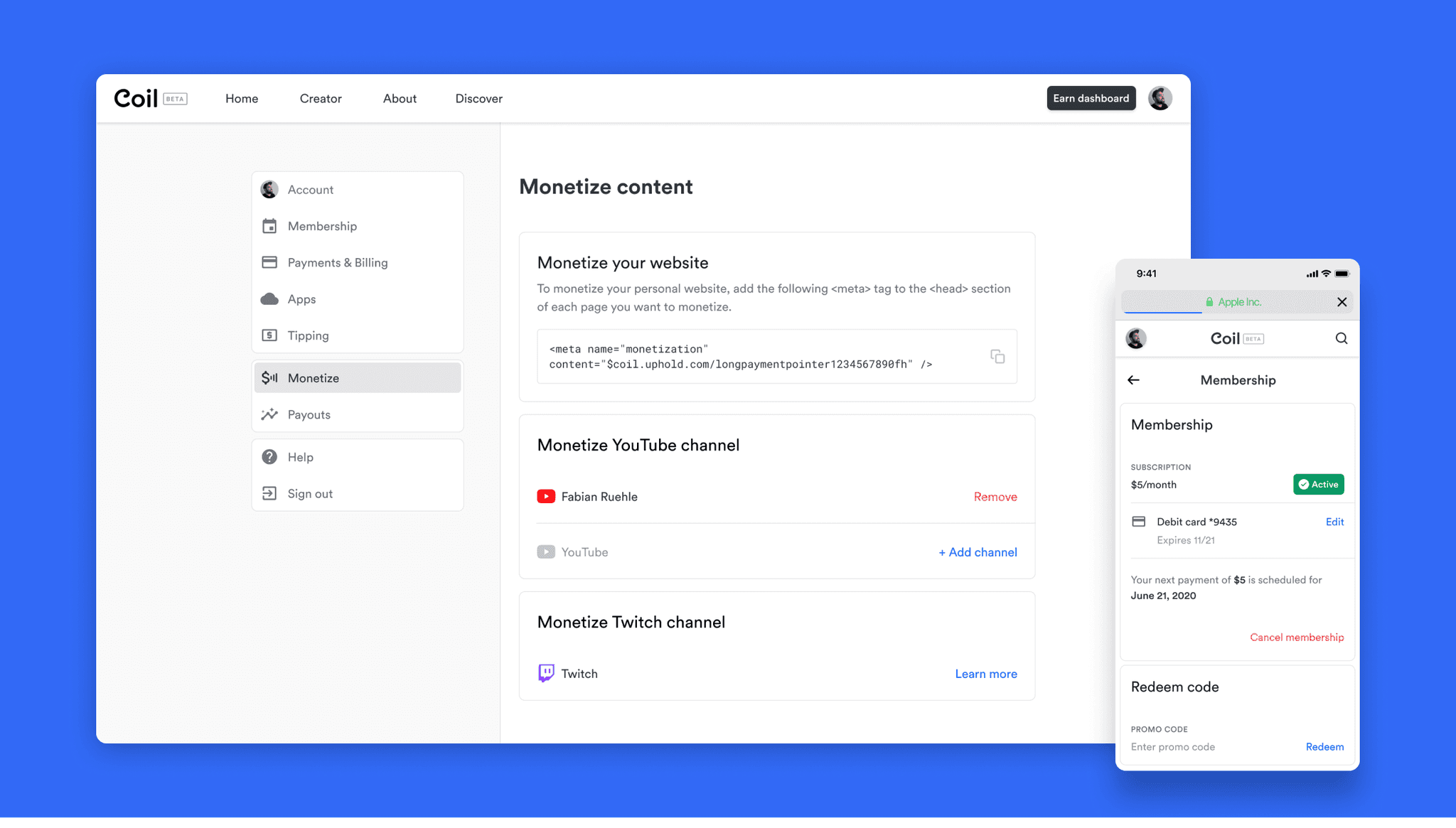
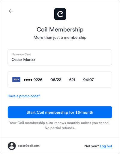
Coil’s main product was the Coil Membership on Coil.com Members would use the web app to sign up, manage their subscription and discover web monetized content.

Contribution

Creating IA diagrams, flows, wireframes and mockups
Implementing and maintaining design system
Maintaining designs with new product features

Credits

Over 2,000 active subscribers
More than 10,000 websites web monetized

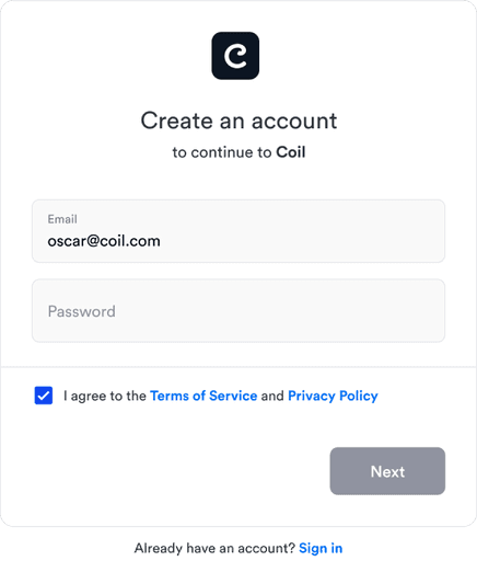
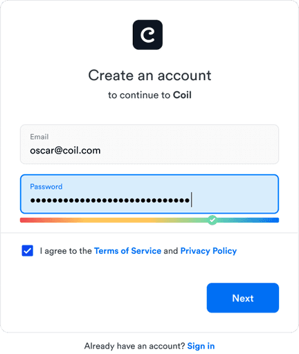
Signup / login flows

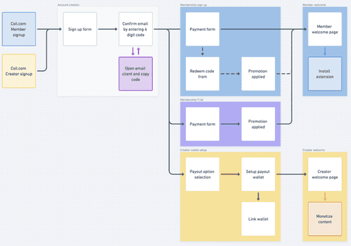
We compartmentalized the signup flow so that we could reuse certain patterns in different flows. Both members and creators required an account, but members were prompted to sign up for membership, while creators needed assistance in monetizing their content.

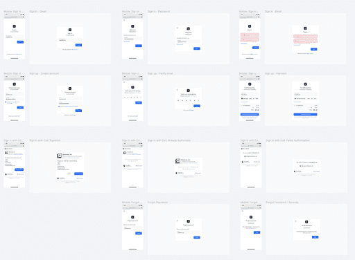
Over time, the signup flow expanded to cover various scenarios, including email verification, magic links, Google OAuth, password strength meters, forgot password flows, username versus email login, and app authorization, among others.

UX flows

Mobile and desktop designs

Example of different screens
Design system

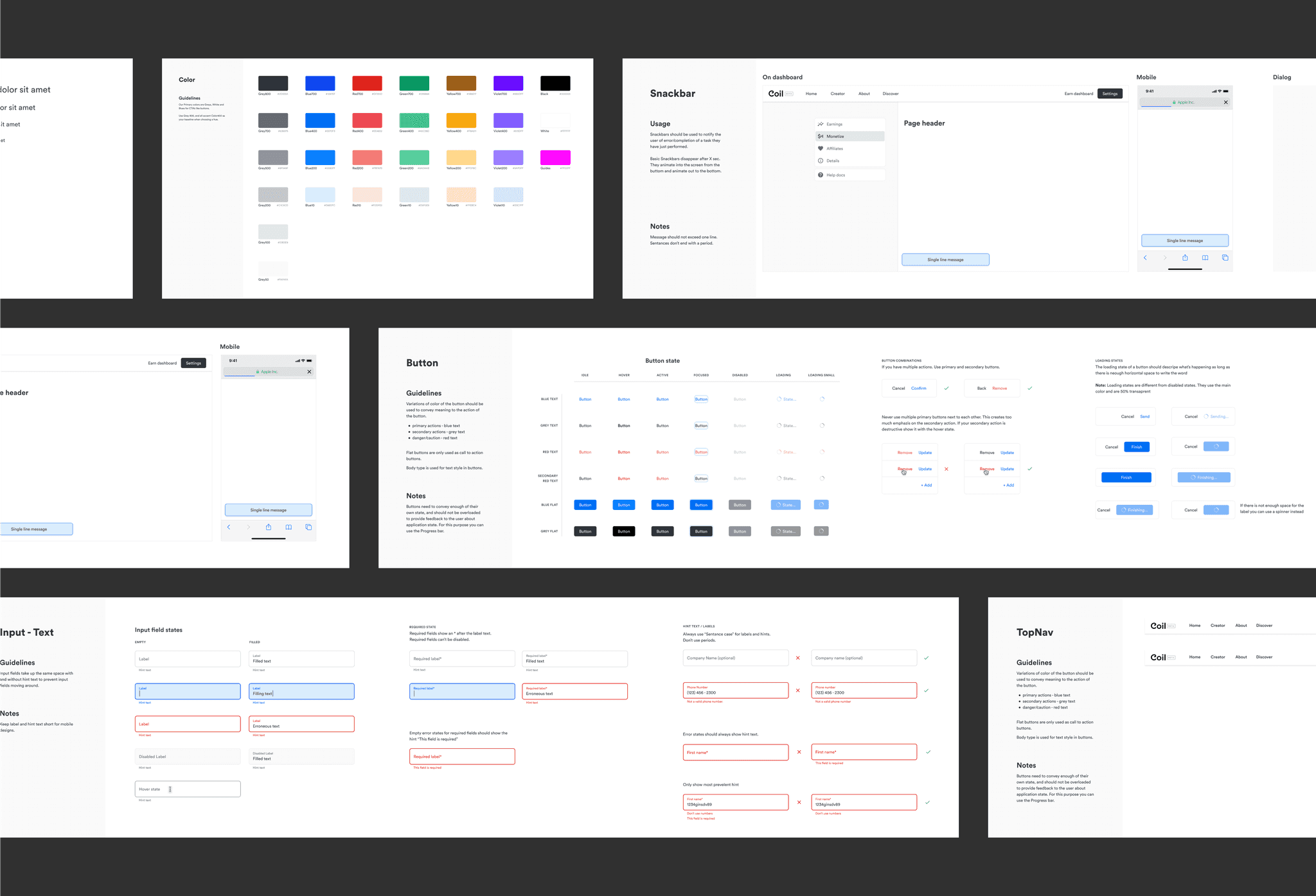
We documented the design system in Figma and our front-end engineer built interactive components in Storybook.
When designing in Figma, we found it most helpful to create components of frequently used elements like buttons, colors, navigations, and callouts. However, we avoided creating components for more complex layouts to keep the design process nimble for faster iteration.
To ensure consistent designs, we had design principles in Figma that all designers followed. One important design principle was the use of an 8px grid, which was the basis for all our designs.