Coil Website — Rethinking the first impression
Leading the effort of updating the Coil website required close collaboration with several teams within the company.
I restructured, redesigned, and rewrote the content for the website to improve the user experience and increase subscription conversions.
The engineering team was understaffed, so I introduced a new implementation workflow that freed up engineering resources and empowered the marketing team to publish content independently.
Contribution
Web design and implementation
UX/UI Design


Information architecture
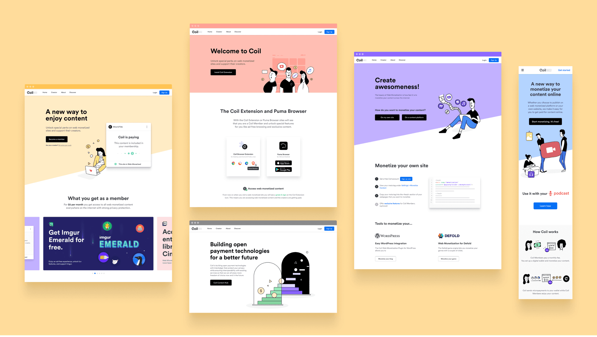
To get the project started, I gathered all the information from our existing website, what we needed to improve and elements we wanted to specifically focus on. I created a quick information architecture diagram to discuss the structure with the team and refine the requirements document.
Initially, the website led with the technical aspects of how web monetization works, which left users confused about what to do on the site. To address this issue, I separated information for subscribers from information for content creators and led with the subscription CTA.

Responsive and dynamic design
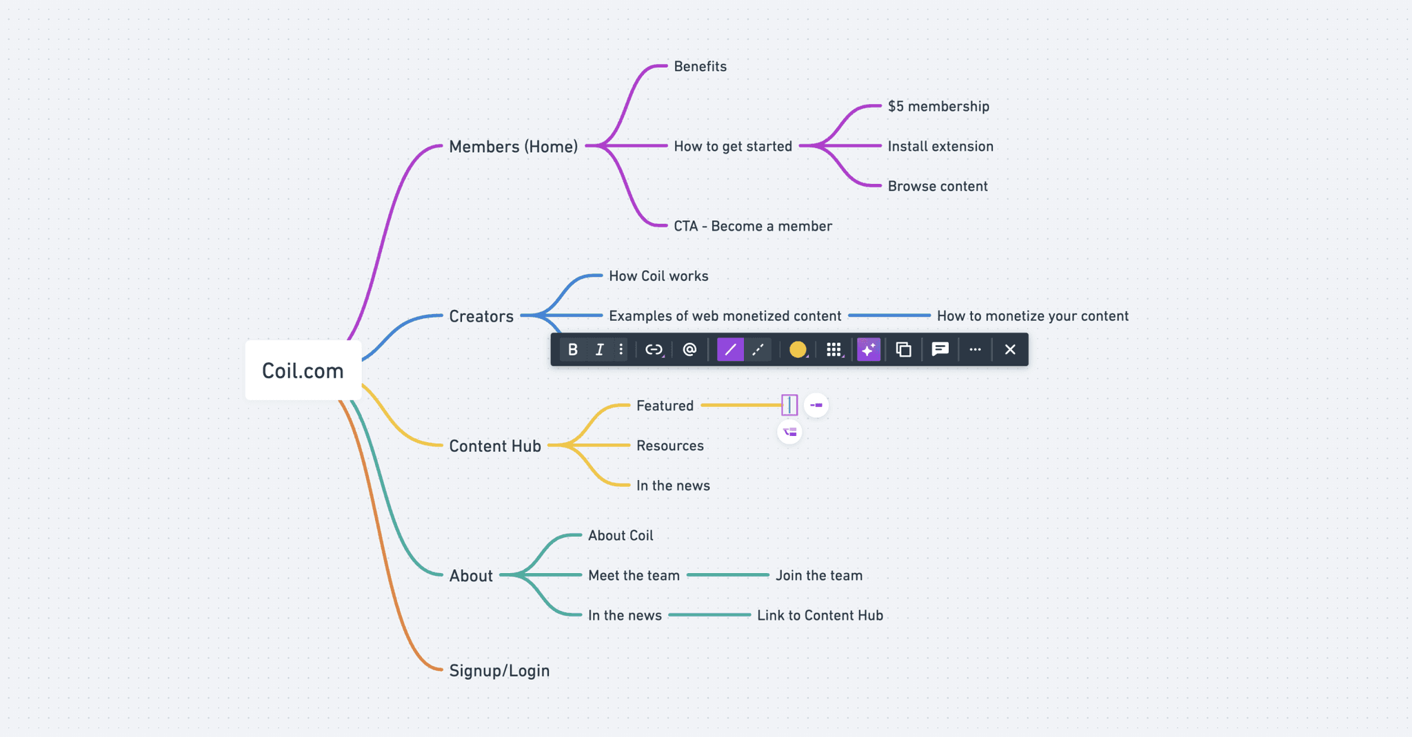
Users had to complete several steps to finish the onboarding process. Since users sometimes abandon the process, I had to come up with a solution to address this issue.
My approach was to create page variants that would remind users of the next step, regardless of when they resumed the process. Thanks to this approach the engineering team was able to simplify the otherwise complex conditions in our onboarding flow.
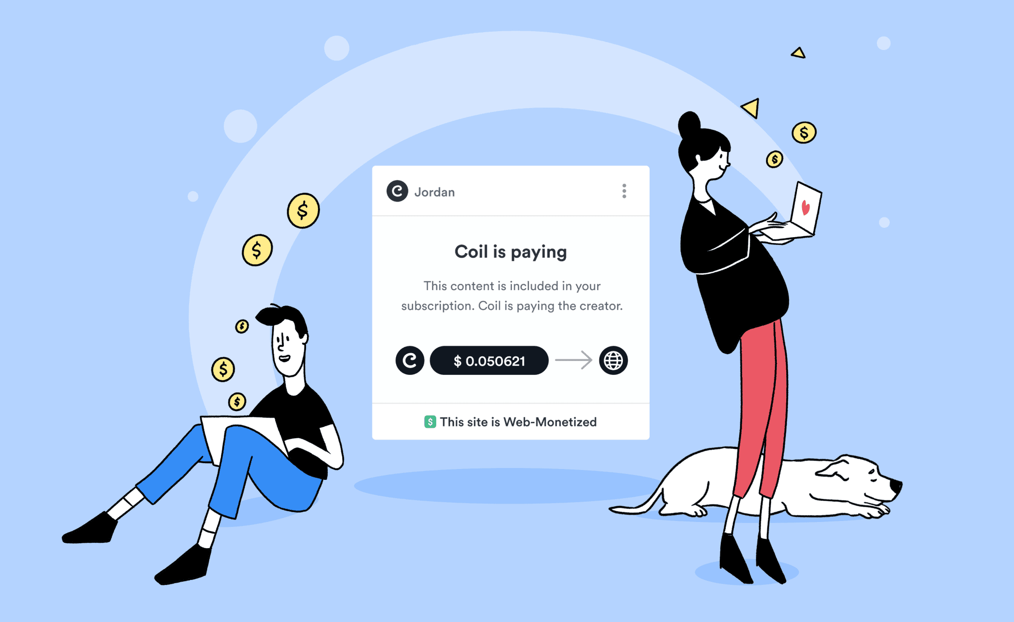
I was able to determine whether the user was subscribed and had the Coil extension installed using a custom code snippet from our engineers. Based on this information, I would display one of the variants shown below.
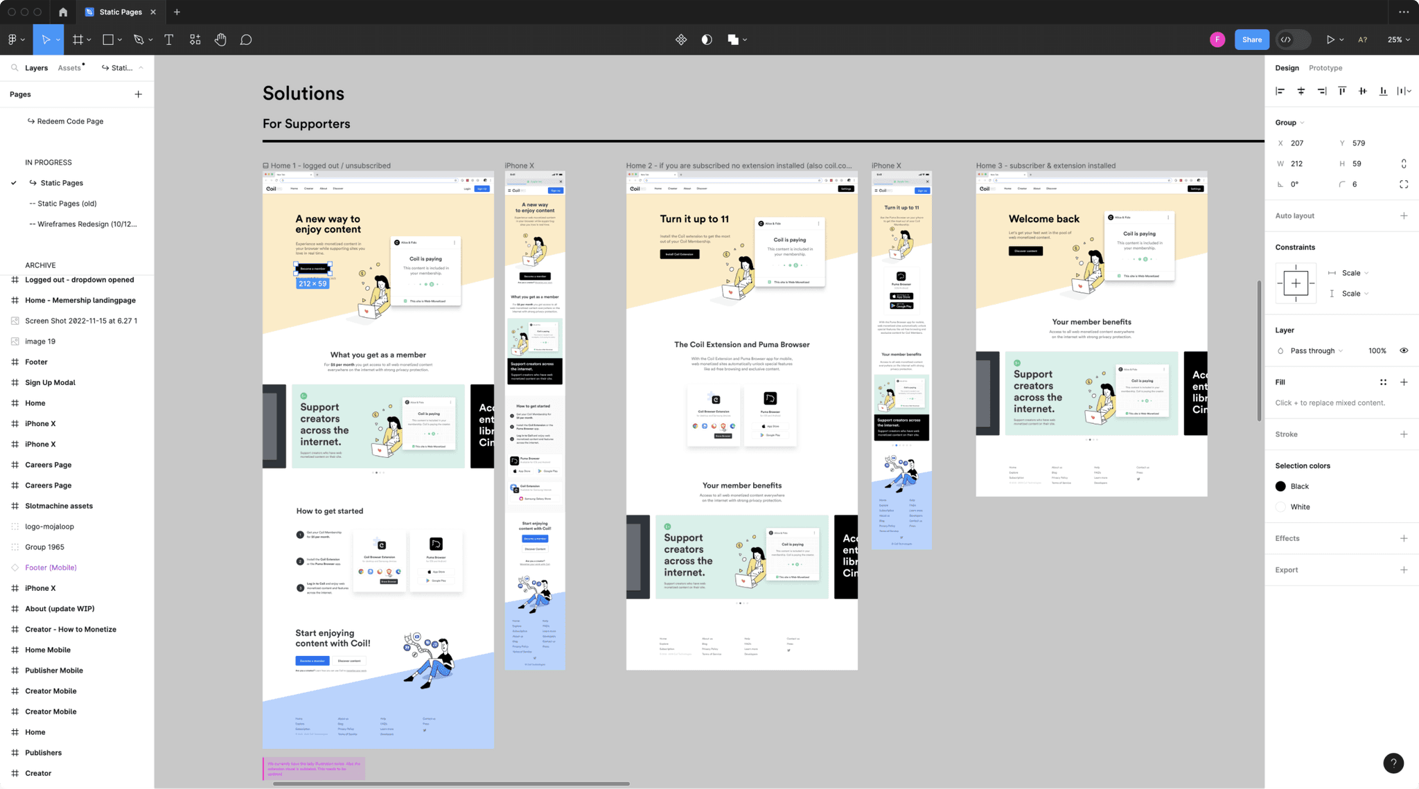

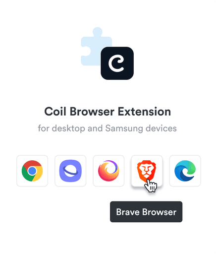
To ensure that subscribers installed the browser extension, I used responsive design to display the appropriate cards and make them disappear after the extension was installed.
To ensure that subscribers installed the browser extension, I used responsive design to display the appropriate cards and make them disappear after the extension was installed.


Desktop


Mobile
Hide card once extension is installed
Visual storytelling & illustrations
After changing the structure of the homepage to lead with the subscription sign-up, we still needed a section to explain Web Monetization. I was looking for something that would be easy to scan, didn't require a lot of reading, and wouldn't distract from the main call to action. As a result, I decided to use visual storytelling.


Subscribers pay a flat fee every month. Creators web-monetize their content.


Coil sends micropayments to creators for every second that subscribers enjoy their content.
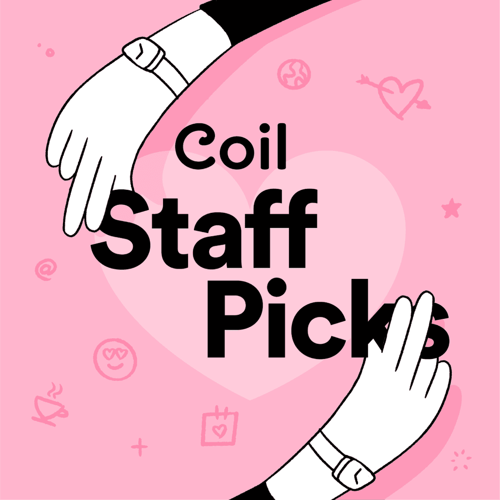
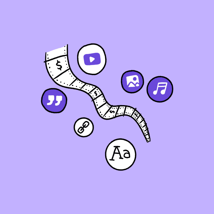
For Coil's website, I created an illustration style that emphasized the grassroots movement of an alternative monetization model. With whimsical, simple black-and-white cartoon characters on pastel-colored backgrounds, I gave the site a friendly and approachable vibe that highlighted the DIY spirit of our beloved content creators.
For Coil's website, I created an illustration style that emphasized the grassroots movement of an alternative monetization model. With whimsical, simple black-and-white cartoon characters on pastel-colored backgrounds, I gave the site a friendly and approachable vibe that highlighted the DIY spirit of our beloved content creators.








Implementation
After designing all the individual pages, I imported the visual assets into Webflow and built the website, adding some subtle animations.
To deploy the website, we needed a way to integrate the Webflow static pages into our React app. Unfortunately, Webflow didn't offer a method to integrate with React. Hence, we created our own workflow to seamlessly integrate the static pages with our web application, providing us with the best of both worlds. This workflow allowed designers to build and edit websites, freeing up engineering resources.
Empowered the marketing team
I like to help out other team members, but it’s even more satisfying when you can actually empower other team members.
Our marketing team had been asking for a place to post articles, news and thought leadership around Web Monetization on Coil.com. Since the engineering team didn’t have the bandwidth to maintain a CMS system I suggested building a small CMS using Webflow.
This approach did come with certain limitations. For instance, the CMS had to be hosted on a subdomain. Although this was not optimal for SEO, I tried to bridge the gap by making the navigation between the two sites as seamless as possible.
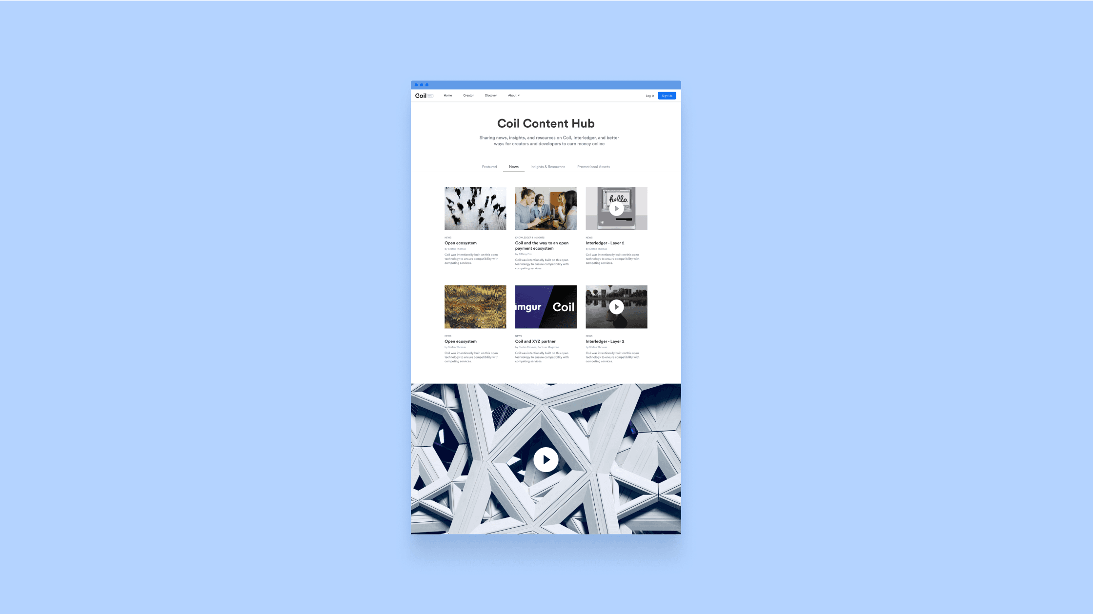

If we had more resources, we could have built a robust CMS directly integrated into the homepage. However, at times, you don't have the luxury to go all out.
Nevertheless, I managed to provide the marketing team with a design and implementation of the Coil Content Hub, and taught them how maintain it themselves going forward.